Hello there readers. Excuse the lateness of this week’s QOTW. I’d originally intended to write this one yesterday, but I ended up having my arm twisted into going to a gig to pick up a record I’m supposed to be reviewing for my other site. Although that’s a total lie – except about the record – as I really wanted to go see Iron Chic. I like punk rock, you know?
ANYWAY. Here we are, at last. The thing I wanted to talk about this week is tangentially related to the whole idea of immersion, and was inspired in part by what Leigh Alexander has been tackling recently over at Sexy Videogameland, in a piece for Kotaku (I hope that link works; I’ve had bad experiences with external links to Gawker blogs) and also in some of the FFVII letters. Although she’s plenty more to say than this – and I recommend you follow up those links if you’ve a few minutes to spare – the bit that really interests me is the argument that in pursuing the current trend toward photorealism in videogames, something very special is being lost: the power of imagination to fill in the gaps.
Alexander mentions Final Fantasy VII with its clumsy character models and crude yet expressive dialogue alongside the Pokemon games’ simple sprites as examples of this: simple characterisation that allows the player’s imagination and innate creativity to fill in the gaps and thereby generate a world, and an experience, far more personalised and unique than any amount of realistically rendered trees and stubble could ever manage. It’s essentially the old “the book is better than the film” argument transplanted into another medium.
It’s an argument I’ve a lot of sympathy for, and I certainly recognise it in a lot of today’s big titles. But I’m also interested in the idea that games may not be drawing from a particularly diverse well in terms of their art direction. Now, this is a more difficult argument to make, and the path is treacherous underfoot, because the unbridled creativity of proposals, early design documents and concept art must always be reigned in in order to meet the technical and budgetary realities of game development. But all the same, there’s an awful lot of ideas out there that just don’t seem to be plumbed by the games industry. There are exceptions – Dylan wasn’t keen on Stacking but its unique visual style still shone through, and before Squenix codified their characters and monsters their approach to design was a breath of fresh air.
Comics are a medium with more – potential – visual creativity and flair than the vast majority of games out there, and I thought I’d link up a few examples from a couple of comics I’ve been enjoyed recently, or was reminded of by this line of thought. I’ll give them a quick intro but then leave them to speak for themselves.
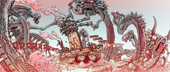
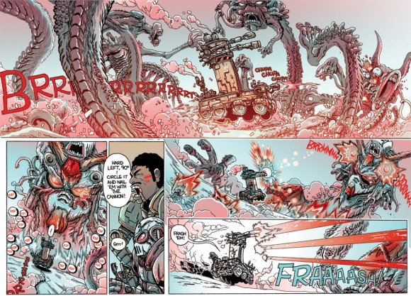
First up is the one that took me the longest to find again – it’s a one-off unpublished comic by a chap called James Stokoe, who is currently working on something called Orc Stain, which I’m keen to read. But the comic I want to mention is called Murder Bullets, a gonzo post-apocalyptic tale full of some of the most grotesque and impossibly ridiculous mutants I’ve seen. Click to embiggen this image:
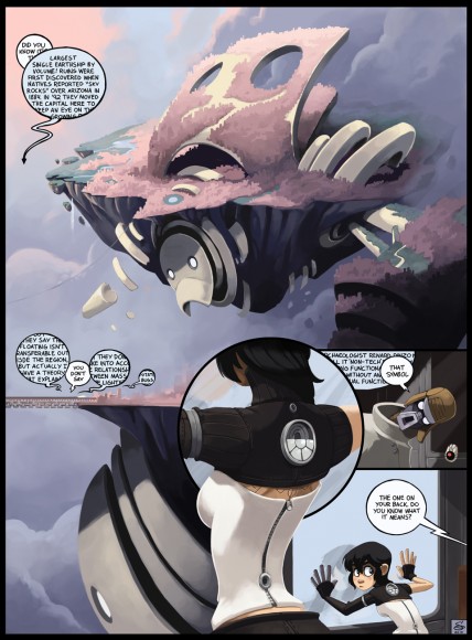
Next up is one from an enduring and utterly unique – if infrequently updated – webcomic called Dresden Codak by Aaron Diaz. If you dig science, SF, post-humanism and high-concept takes on low humour, then this is not to be missed. Here’s a clip from his current ongoing series:
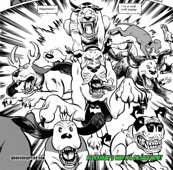
And last but not least my most recent discovery, the 2000AD-esque Weapon Brown by Jason Yungbluth. It’s played pretty straight for a post-apocalyptic pastiche of the Peanuts comic strips, starring a weaponised Charlie Brown and Snoopy working as grizzled mercenaries in a brutally violent world populated mostly by characters, old and new, from syndicated comic strips. This one is a bit harder to find a representative image of – Yungbluth’s work is in black and white and mostly revolves around fine detail and the skilled integration of different character styles into his own – but here’s a great recent image starring a number of characters you may recognise:
Before I wrap up I feel the need to shoot myself in the foot – only gently, mind – and acknowledge that comics and games are extremely different mediums, although today both tend to be highly visual. It’s tough to present the sort of images I’ve embedded above in a game whilst allowing a player freedom and agency, for example. But all the same I’d like to see studios and developers and publishers giving their artists freer reign to produce something unique or at least different. Take American McGee’s Alice: it’s fondly remembered today not for its shonky platforming and infuriating camera, but rather for the way it put an unusual spin on a classic story and closely integrated its visual and overall design.
As always, I’ll finish by asking what you think…


Comments
4 responses to “QOTW: More imagination and weirder art, right?”
This is a hell of a question to answer, I've tried several times now to write something up but I haven't been able to properly formulate my thoughts. I don't think there is any short-winded answer to this.
It looks like you're not the only one, Gordo.
I would have liked to try and develop this one into a longer piece, something a bit more in-depth, but unfortunately I'm not sufficiently au fait with art direction in games or visual techniques in entertainment in general. Hence my enthusiastic babbling above…
Sorry was going to post earlier but have been debilitated or busy. There are a couple of games with striking and different art direction that I have played one good, one not so good. Limbo being the first and the beat 'em up called Zeno Clash.
The latter was interesting because I palyed it more to see more of the scenary than anything else as the mechanics for fighting were fun but limited and then they introduced guns and it got a bit dull.
The problem with a lot of 'out there' art design is how to create level geometry around what you have made and keep it coherent with the rest of the world. As much as we might want crazy spires and the like, making believable interaction with those kinds of shapes is really difficult. I mean, we struggle to have characters hold hands or hug convincingly at the moment and the way people freaked out because Niko Belic would adjust the way he stood when he was on an uneven surface is telling of where we are at the moment when it comes to this sort of thing.
These kind of crazy visuals are usually limited to backgrounds that no one can interact with, sadly I don't see this changing anytime soon.
Really like Dresden Codak (can't remember whether I introduced you to that comic or the other way round), the art style actually reminds me of a combination of Mirror's Edge and Beyond Good and Evil
Yeah, the technical barriers are probably the key ones. In retrospect I'm not 100% sure what it was that I wanted with this piece.
I was introduced to DC about three/four years ago, I thought by my friend Paul Raven (mutual SF nerding), but my memory is shocking and that may be wrong!